Control Charts

Control charts, also known as Shewhart charts or process-behavior charts, in statistical process control are tools used to determine whether or not a manufacturing process is in a state of statistical control.

What is a Control Chart?

Much of its power lies in the ability to monitor both process center and its variation about that center. By collecting data from samples at various points within the process, variations in the process that may affect the quality of the end product or service can be detected and corrected, thus reducing waste as well as the likelihood that problems will be passed on to the customer. If the process is in control, almost all (99.73%) points will plot within the control limits. Any observations outside the limits, or systematic patterns within, suggest the introduction of a new (and likely unanticipated) source of variation, known as a special-cause or assignable cause of variation.

Points representing a statistic (e.g., a mean, range, proportion) of measurements of a quality characteristic in samples taken from the process at different times

The mean of this statistic using all the samples is calculated (e.g., the mean of the means, mean of the ranges, mean of the proportions)

A center line is drawn at the value of the mean of the statistic

The standard deviation of the sample population is also calculated using all the samples

Upper and lower control limits (sometimes called “natural process limits”) that indicate the threshold at which the process output is considered statistically ‘unlikely’ are drawn typically at 3 standard errors from the center line

Control Charts display averages, ranges, or standard deviations relative to the natural process limits defined by the data that has been collected in the SPC run.

Control limits can be broken in the middle of a run in order to establish comparative relationships before and after a major process change.

The Advantages Of

Control Charts

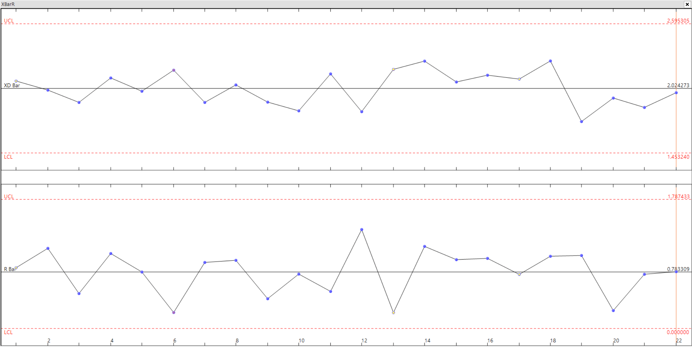
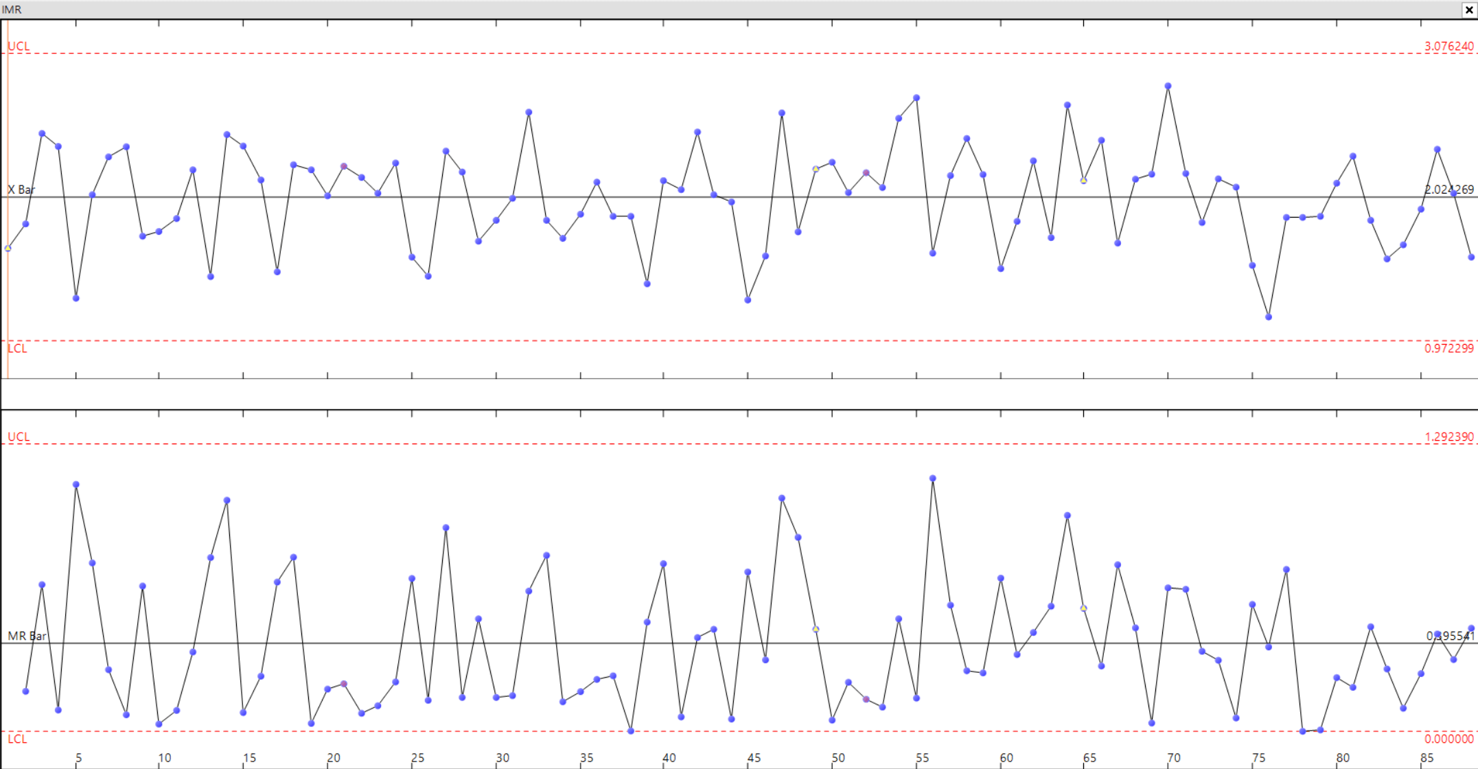
These charts are particularly helpful for machine dominant processes. The X-bar (mean) chart tells when a change has occurred in central tendency. This might be due to such factors as tool wear, a gradual increase in temperature, a new batch of material of greater toughness, or a different method by a night-shift workman. In looking for causes when an R (range) chart is out of control, look for poor repair or poor maintenance if this is a machine controlled process. Look for new operators or something disturbing the operators if this is an operator controlled process.

Explore All Products